Airborne Bicycles
E-COMMERCE WEBSITE
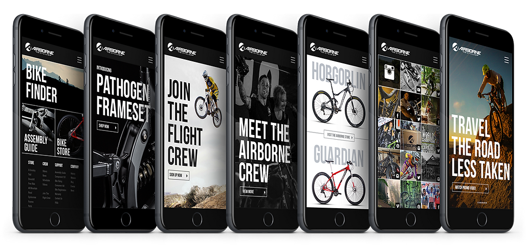
Airborne is an ideal choice for aspirational downhill and mountain bikers. Originally founded in 1997, they were one of the first bike companies to sell direct to consumers. The company engaged Brunner with the task of redesigning their existing website bringing it inline with current best practices and realignment of current business goals.
I have omitted and obscured confidential information in this case study. The information in this case study is my own and does not necessarily reflect the views of the client.

The existing site was packed with issues, but the most notable were lack of a modern responsive solution, poor architecture, site organization, and simple design. Usability concerns were prominent, in addition to an e-commerce experience not implemented alongside a content management system to allow simple, yet effective site and product management.
The Solution
Our solution was to create a new, richer experience from the ground up that would be heavily rooted in e-commerce best practices, a shared backend with other brands Huffy and DK Bikes, in addition to social media integration to increase user engagement with the Airborne brand, products, and pro team.

The Problem
My Role
I was responsible for experience strategy and design of the website. I lead the UX work, producing all major deliverables, while conducting presentations and direct communications with the client. I worked closely alongside the development team in making sure we produced the best quality, and yet simple experience for our consumers.
Challenges
The first challenge was to provide primary information about the Airborne brand while driving direct to consumer purchase, in addition to creating a sense of legitimacy and prestige for their brand standards that wasn’t applied previously. Design and overall experience needed to look expensive and higher end, for the website was their primary means of marketing to their consumers.
The project timeline was strict. With the combination of research, UX, design, development, QA and testing, we had to nail the experience correctly within early stages.

Research
We tried to stay focused throughout the research phase by making it simple and effective. We gathered as much data as possible through consumer/employee surveys, interviews and site analytics. We also created a detailed competitive analysis that provided insights in differentiating Airborne from main competitors.

User Stories
Next, we created user stories as a holistic approach in understanding our customers functional needs in relation to what they aim to achieve throughout each stage of engagement. Visualizing this journey assisted everyone into appreciating the emotional route users would take within the site experience.

Personas
After acquiring qualitative insight from the interviews and surveys I formulated personas based on different user types that would potentially visit the website. These personas helped create empathy and provided added context in which to explore design solutions.

Task Flow
Task flows assisted in rationalizing user steps and actions through the new site structure before anything was initially designed and developed. It helped us refine our improved
e-commerce experience by injecting the user into appropriate scenarios.

Site Map
My next task was to consolidate, sort out and reorganize the site’s content to begin constructing a well-defined framework to begin wireframes. New additions were added to improve the existing site experience, as well as simplifying and improving user’s path to purchase.

Wireframes
Detailed, high-fidelity wireframes were then created based on approved sitemaps. These started as rough paper sketches that eventually evolved into clickable prototypes using InVision. This created a simple, visual representation of the user interface, creating a container for which design and content could later flow into.


Usability Tests
Considering the strict timeline and creeping launch date, we needed to move quickly with usability testing. After presenting all UX deliverables to the client and team, InVision links and documents were shared. Feedback was supplied, revised and approved before moving into design.


The Result
Adapting Airborne’s brand standards to my refreshed UI and brand visuals transformed the brand into a more exclusive and higher end product that can now shine amongst the competition. Having the opportunity to work with professional riders such as Barry Nobles, and multiple world championship and Olympian Caroline Buchanan, gave us the ability to produce great content and assets for the site. The e-commerce experience had now become simplified, helping produce even more revenue based on post-launch analytics than ever before.


